Kohl’s Department Stores
As a experience designer at Kohl’s I designed experiences across a variety of touchpoints including, responsive websites, in-store kiosks, mobile apps.
Transaction
I was the lead designer for the transaction experience across all digital properties. Our team conducted in person interviews to define how and where customers consider and engage with Kohl’s. Based on this research, we designed a series of initiatives to meet customers' needs along their shopping journey. While price and discounts are key to Kohl’s value proposition, we wanted to extend that value beyond just the checkout. We brought visibility to savings while customers are browsing and considering items, and focused on increasing post-purchase satisfaction by integrating rewards and loyalty programs. Throughout the transaction design process, we validated design solutions with on-site user testing, before implementing them in full scale.

Many Kohl’s customers were very budget-conscious, and wanted to know what their final price is going to be while their still shopping and considering items. Our previous transaction experience (and many competitors) only provided an accurate total with discounts at the very end of the checkout. I designed a persistent shopping bag and discount tool for customers to start using their discounts immediately, feel confident that they are maximizing their savings, and getting the most value from their budget.
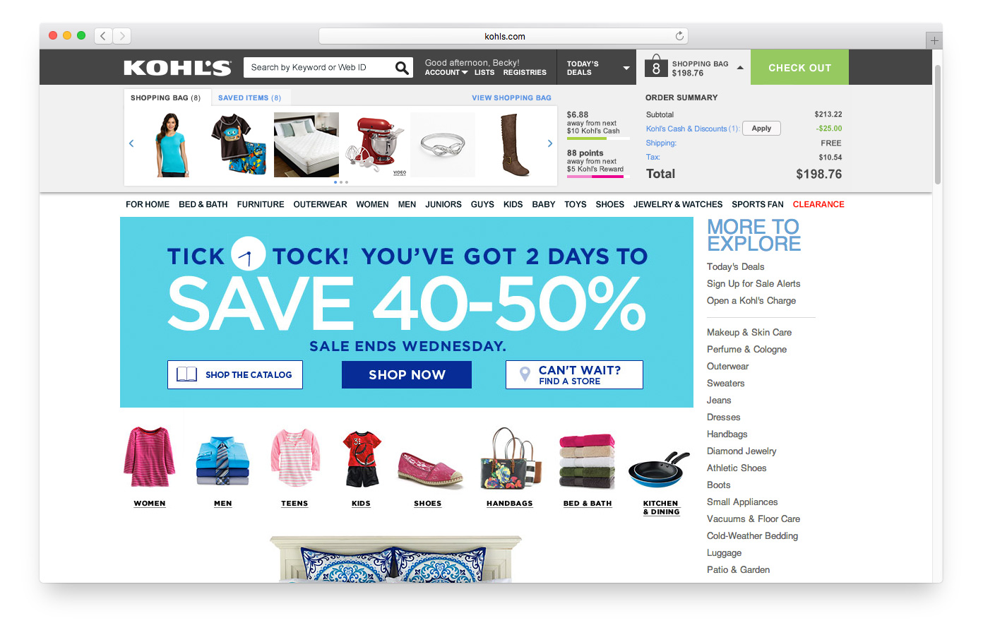
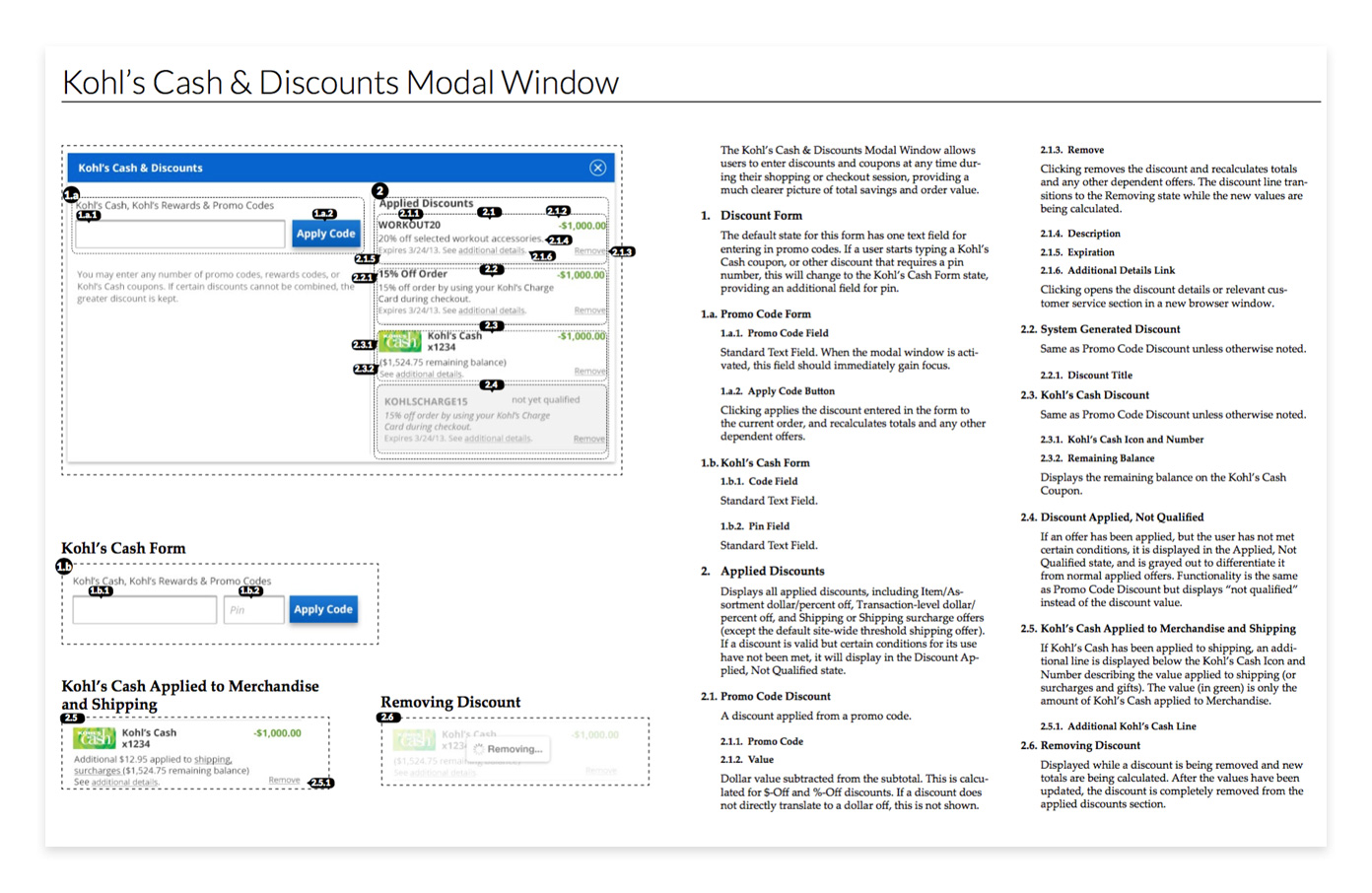
Customers were routinely frustrated and confused by nuanced differences in how Kohl’s calculated various discounts. They were most concerned with the final total, but still wanted to “do the math” to verify that all of their discounts were being applied correctly. I designed a simplified UI for a complicated discount and offer system. Customers could quickly see their total discounts in the shopping bag, but were able to dig into the details if they wanted.
Mobile
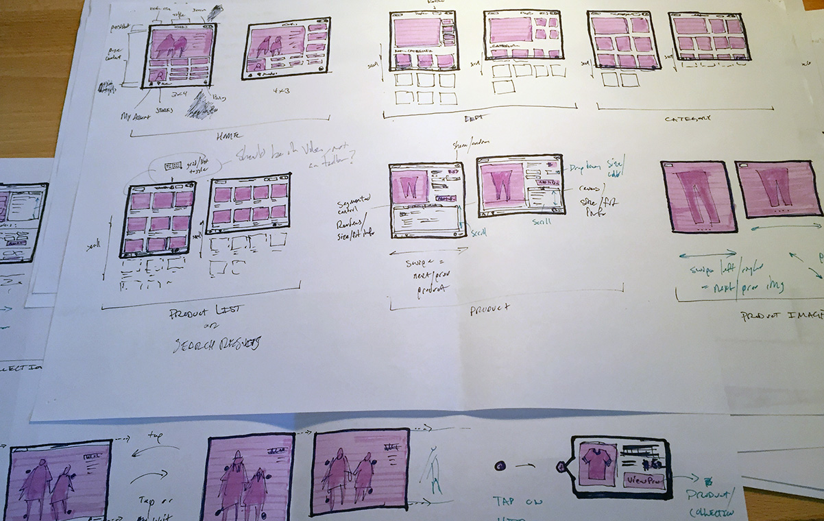
I created the core design language for the first versions of mobile web, iOS and Android phone and tablet experiences, and refined it over several years through iterative design and testing. I prototyped mobile web and app experiences for internal demonstrations and user testing, and created thorough design specifications. For more recent iterations of Kohl’s mobile apps, I lead the design team, collaborating with external partners for detailed design and development.
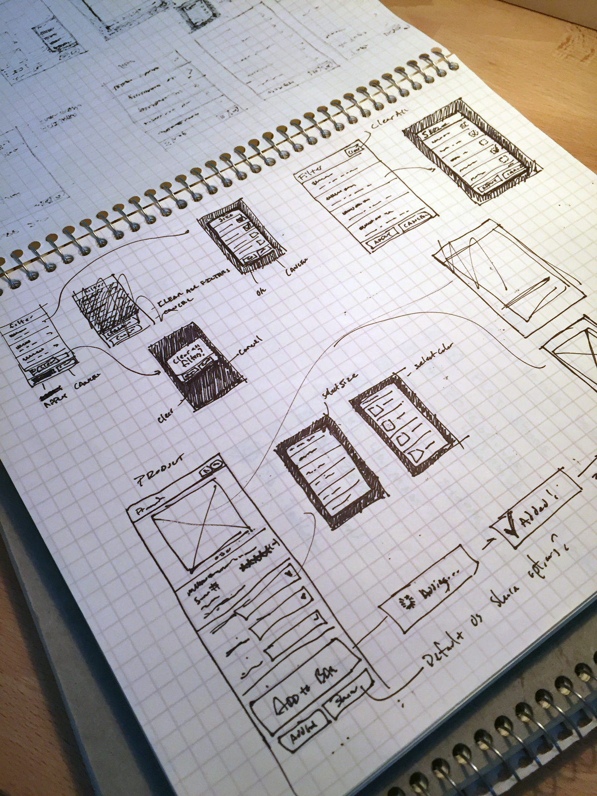
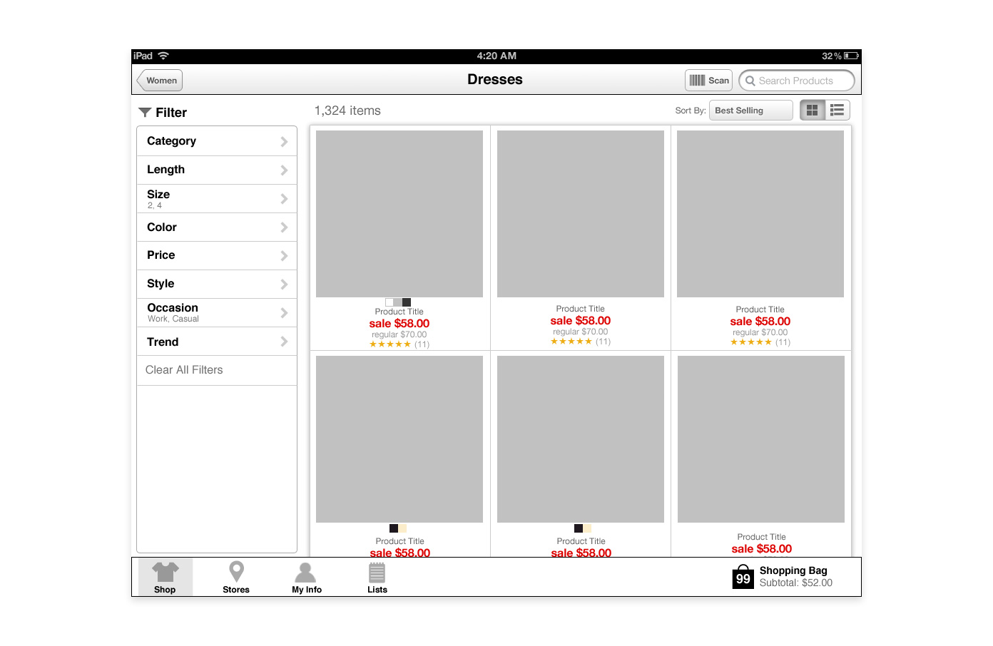
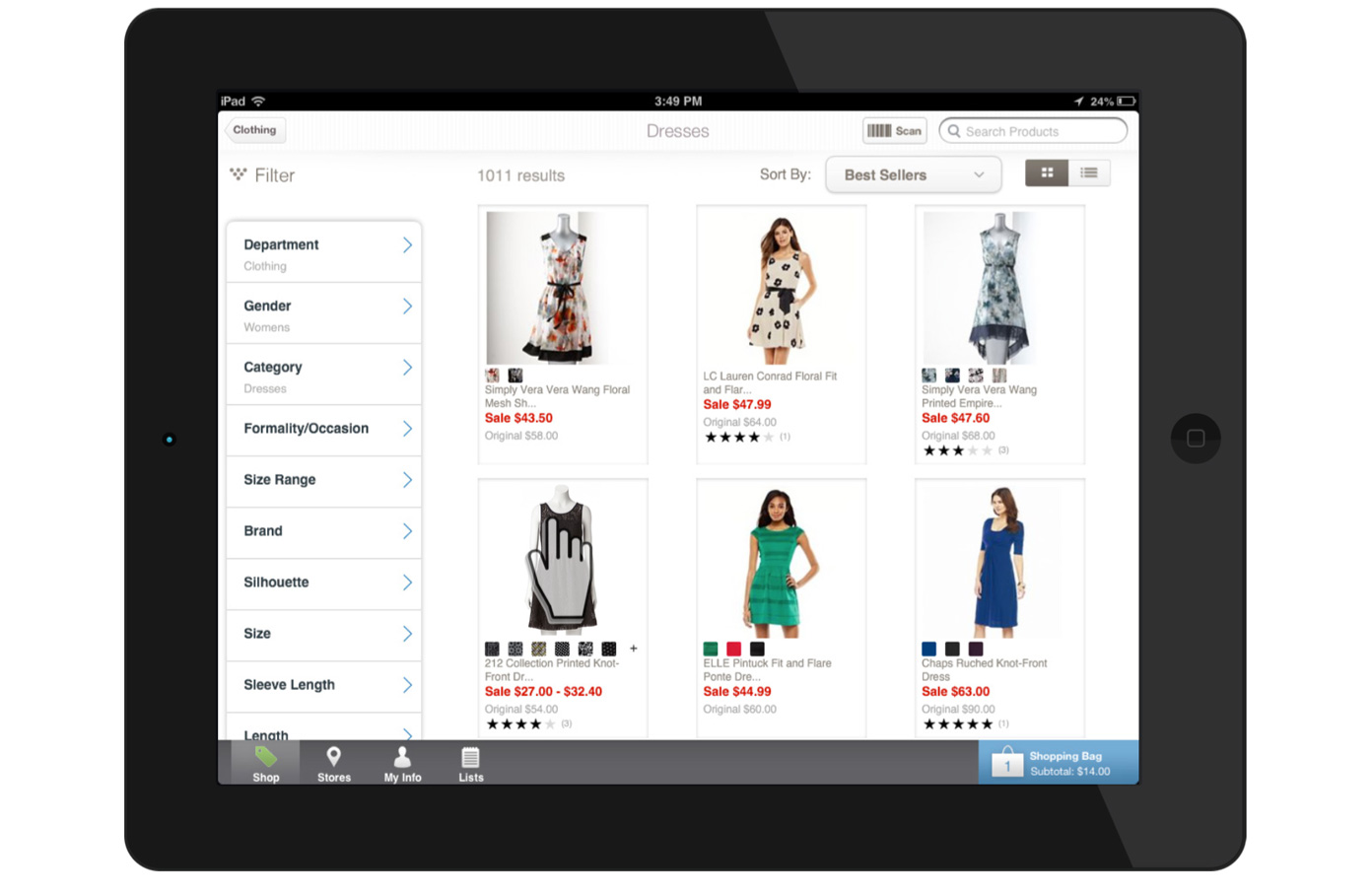
Inspiration Shopping Concept
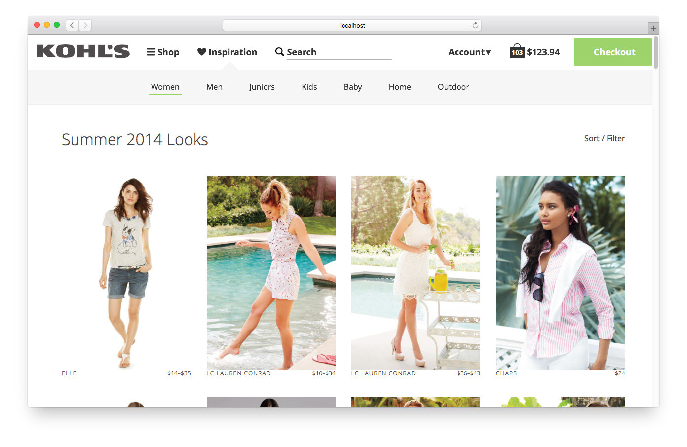
I designed and prototyped a concept interface for Kohls.com focused on shopping by inspiration. Most product navigation on e-commerce websites are focused on directing customers to what they want as quickly as possible. They put a lot of effort into improving search algorithms, navigation hierarchy and product filtering, all methods that help the answer the question: How do I find the product I’m looking for?
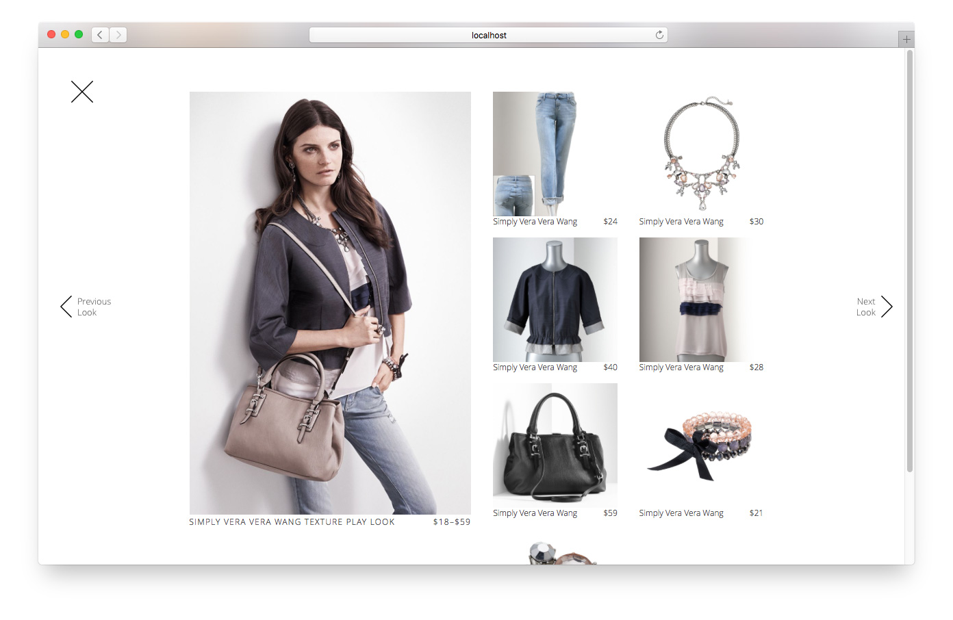
For this concept, I wanted to help customers answer a different question: How do I find a product if I’m not sure what I want? It’s the online equivalent casually strolling through a store, just looking for something to strike you, fill a missing spot in an outfit, or start a whole new look.
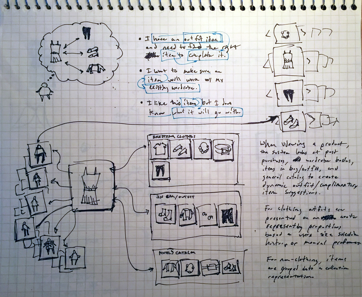
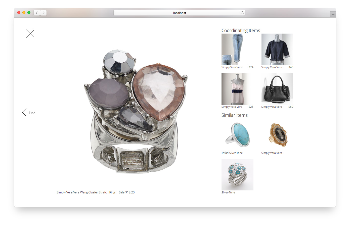
While there are existing third party sites like Pinterest that server similar purposes, often times these sites are disconnected from the actual transaction, with little or no product details, broken links, and unattainable items. The “inspiration” shopping mode on Kohls.com would capitalize on the moment of inspiration and turn it into action: adding to a “favorites” list or purchasing directly. I built the prototype using existing data from the live site, leveraged existing high-quality photo assets and product relationships, to show that that this type of experience could be achieved without a large development effort or additional photography.
UX Pattern Library
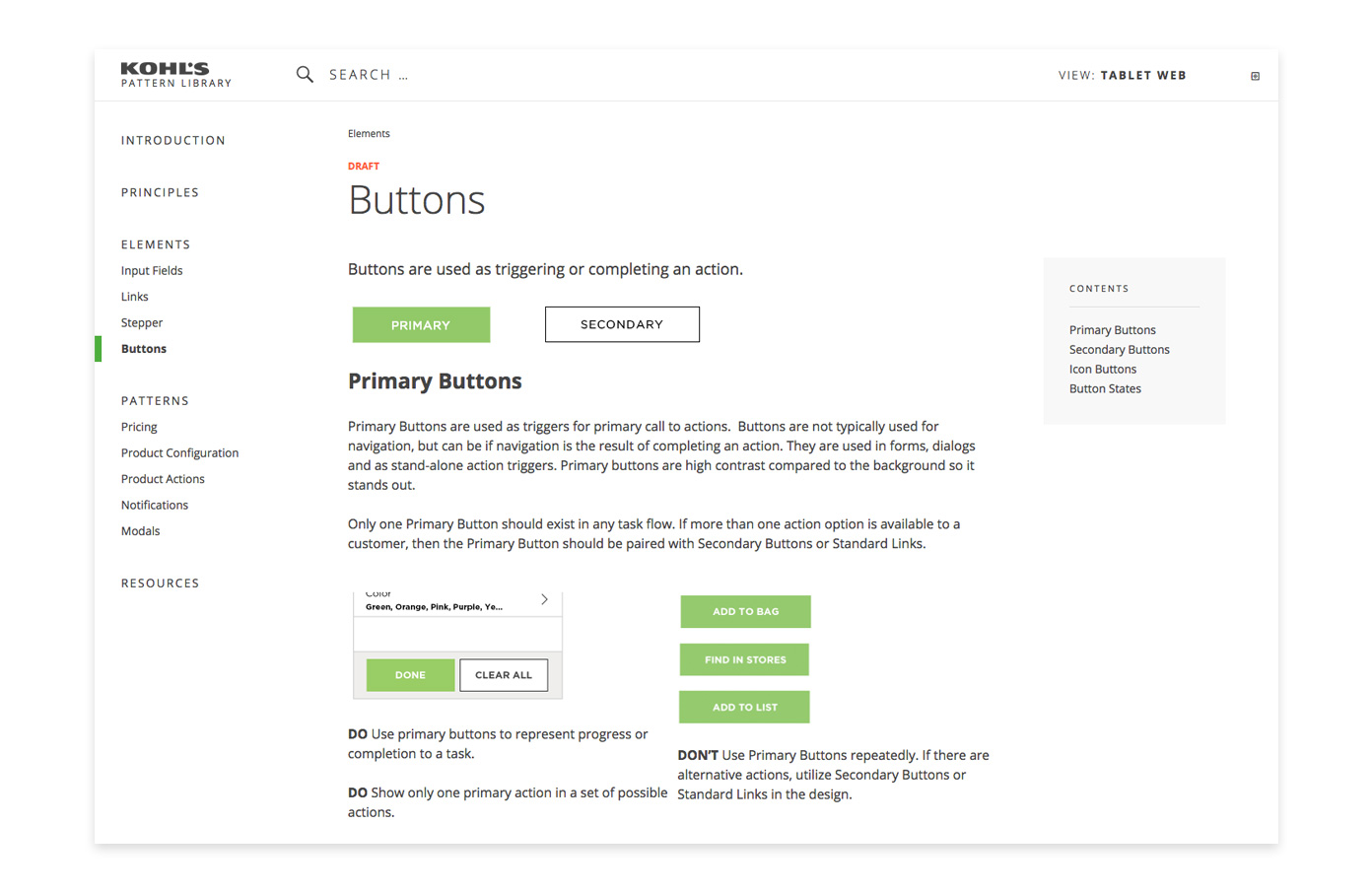
I designed and developed the Kohl’s UX pattern library and website. The pattern library served as a tool for the UX team to increase collaboration and speed up onboarding. It also provided general guidelines for external design and development teams to follow.
